Creating charts in Explore view
Skeyecharts has 2 main interfaces for exploring data:
- Explore: no-code viz builder. Select your dataset, select the chart, customize the appearance, and publish.
- SQL Lab: SQL IDE for cleaning, joining, and preparing data for Explore workflow
We'll focus on the Explore view for creating charts right now. To start the Explore workflow from the Datasets tab, start by clicking the name of the dataset that will be powering your chart.
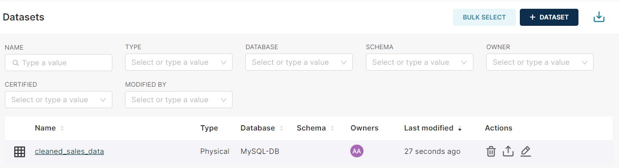
You're now presented with a powerful workflow for exploring data and iterating on charts.
- The Dataset view on the left-hand side has a list of columns and metrics, scoped to the current dataset you selected.
- The Data preview below the chart area also gives you helpful data context.
- Using the Data tab and Customize tabs, you can change the visualization type, select the temporal column, select the metric to group by, and customize the aesthetics of the chart.
As you customize your chart using drop-down menus, make sure to click the Run button to get visual feedback.
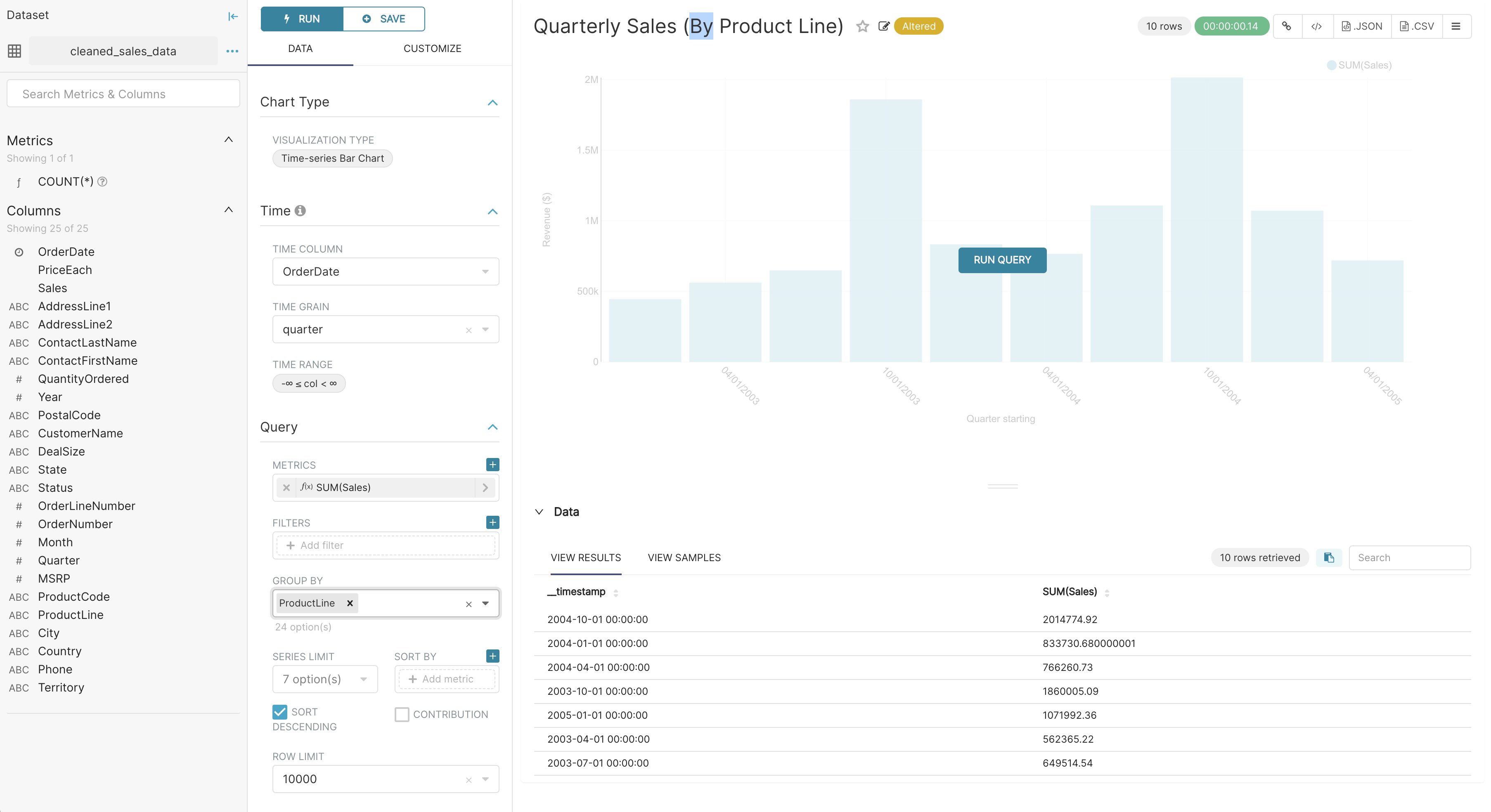
In the following screenshot, we craft a grouped Time-series Bar Chart to visualize our quarterly sales data by product line just by clicking options in drop-down menus.
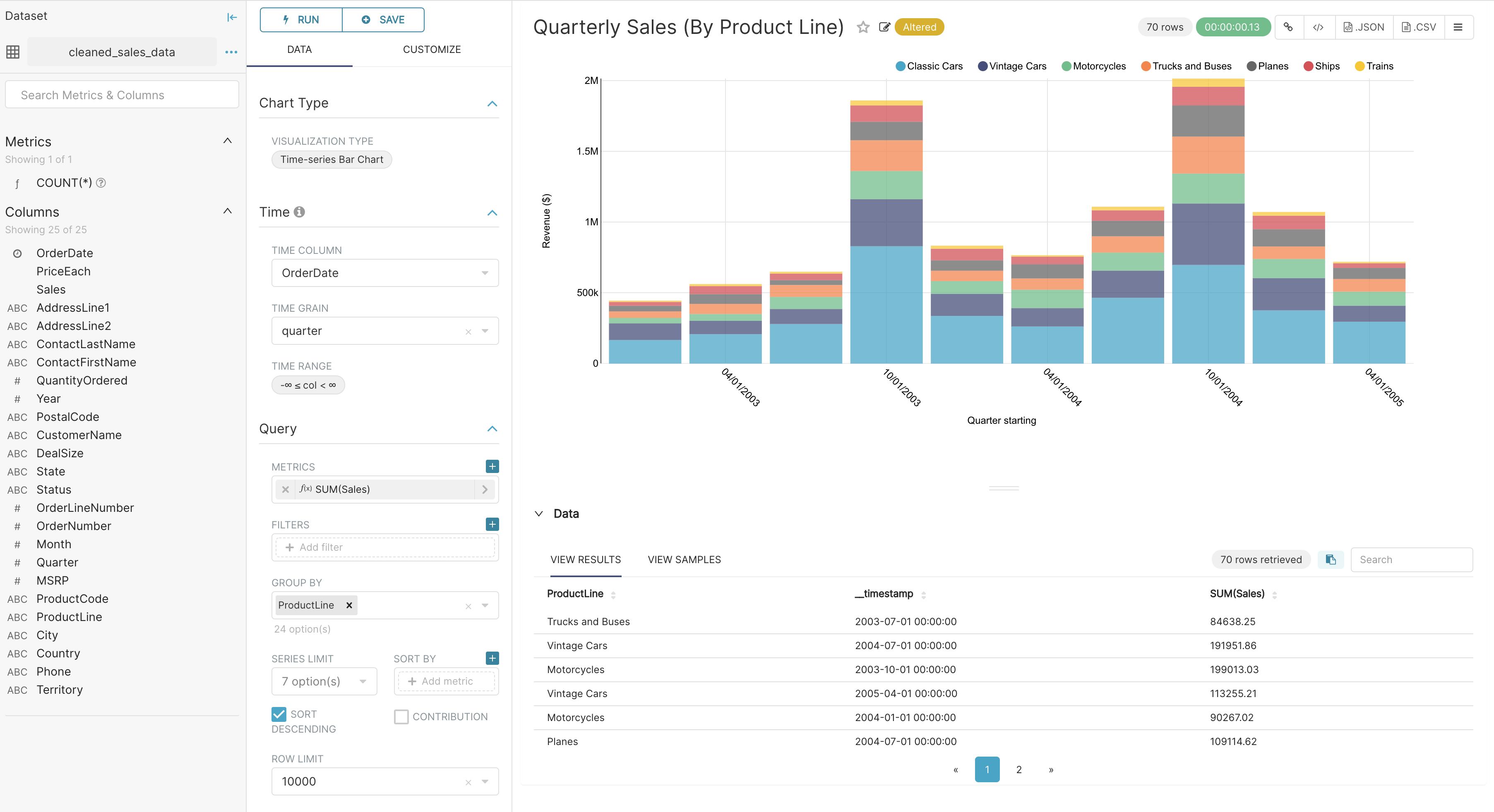
Creating a slice and dashboard
To save your chart, first click the Save button. You can either:
- Save your chart and add it to an existing dashboard
- Save your chart and add it to a new dashboard
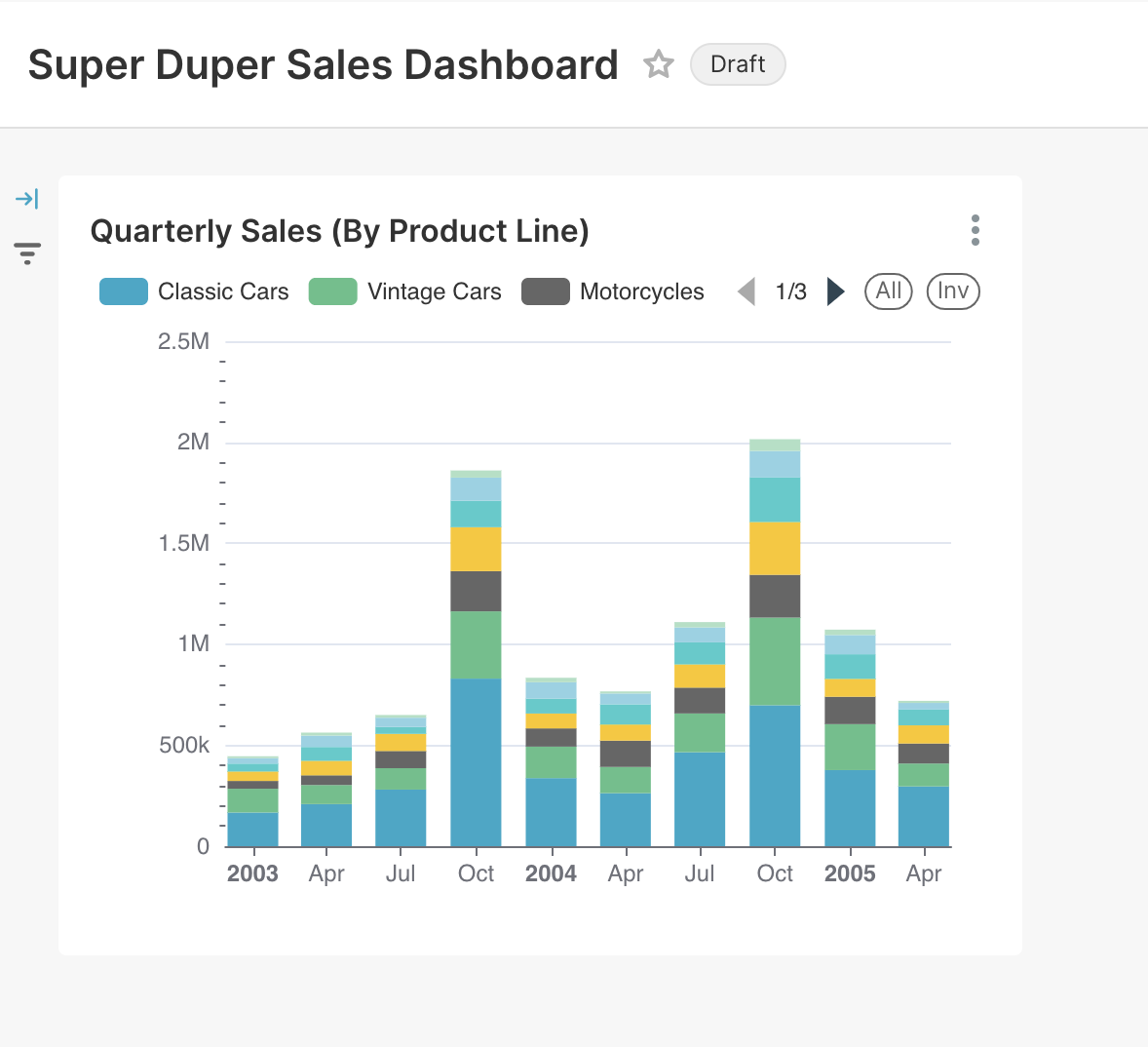
In the following screenshot, we save the chart to a new "Super Duper Sales Dashboard":
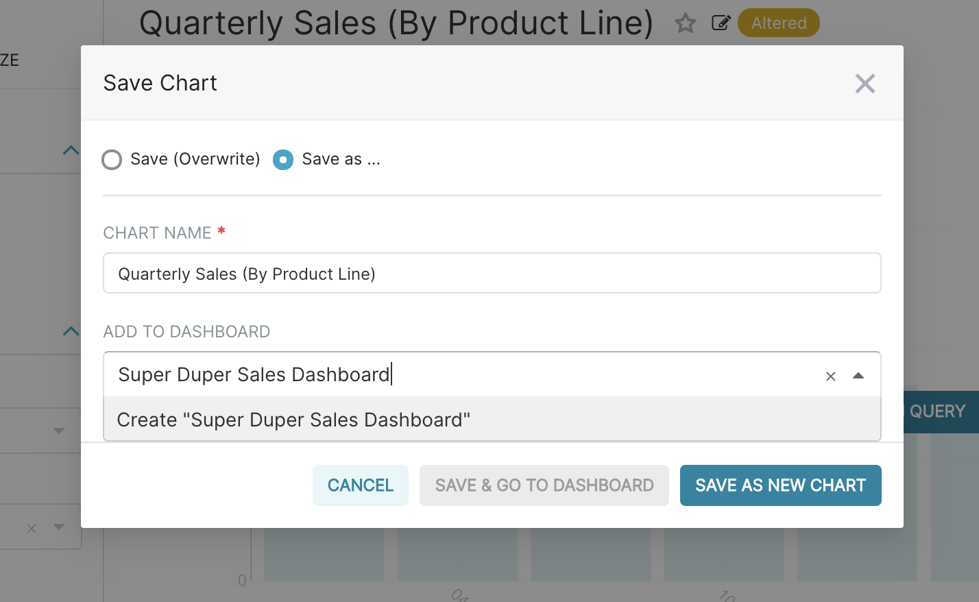
To publish, click Save and goto Dashboard.
Behind the scenes, Skeyecharts will create a slice and store all the information needed to create your chart in its thin data layer (the query, chart type, options selected, name, etc).
To resize the chart, start by clicking the Edit Dashboard button in the top right corner.
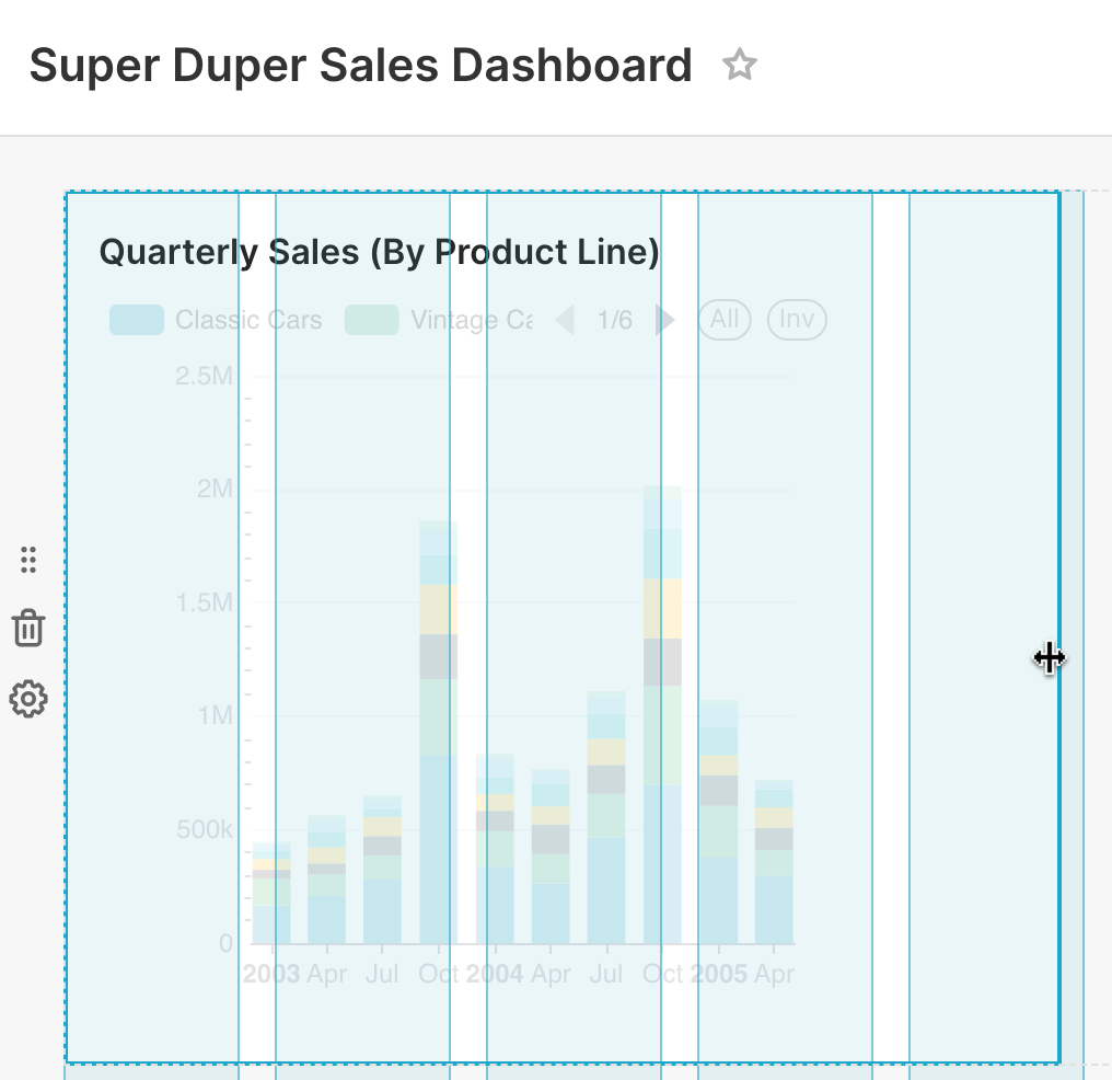
Then, click and drag the bottom right corner of the chart until the chart layout snaps into a position you like onto the underlying grid.
Click Save to persist the changes.
Congrats! You’ve successfully linked, analyzed, and visualized data in Skeyecharts. There are a wealth of other table configuration and visualization options, so please start exploring and creating slices and dashboards of your own
Manage access to Dashboards
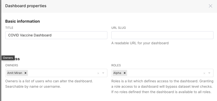
Access to dashboards is managed via owners (users that have edit permissions to the dashboard)
Non-owner users access can be managed two different ways:
- Dataset permissions - if you add to the relevant role permissions to datasets it automatically grants implicit access to all dashboards that uses those permitted datasets
- Dashboard roles - You can manage which roles can access the dashboard
- Granting a role access to a dashboard will bypass dataset level checks. Having dashboard access implicitly grants read access to all the featured charts in the dashboard, and thereby also all the associated datasets.
- If no roles are specified for a dashboard, regular Dataset permissions will apply.
Customizing dashboard
The following URL parameters can be used to modify how the dashboard is rendered:
standalone:0(default): dashboard is displayed normally1: Top Navigation is hidden2: Top Navigation + title is hidden3: Top Navigation + title + top level tabs are hidden
show_filters:0: render dashboard without Filter Bar1(default): render dashboard with Filter Bar if native filters are enabled
expand_filters:- (default): render dashboard with Filter Bar expanded if there are native filters
0: render dashboard with Filter Bar collapsed1: render dashboard with Filter Bar expanded
For example, when running the local development build, the following will disable the
Top Nav and remove the Filter Bar:
http://localhost:8088/skeyecharts/dashboard/my-dashboard/?standalone=1&show_filters=0